← Back to Valentine Coloring Pages
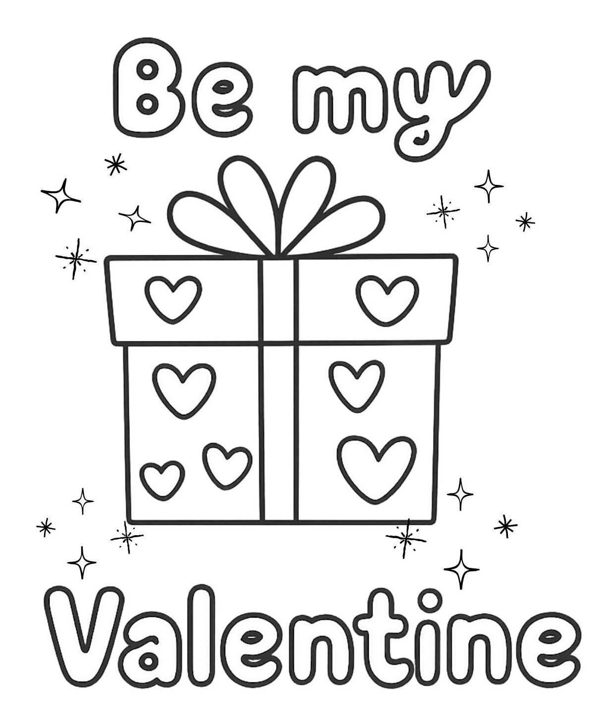
This Valentine’s Day coloring page is organized into three clear zones.
Top: the short message “Be my.”
Center: a gift box with heart details.
Bottom: the word “Valentine.”
Each zone serves a different role. The top text introduces the message, the gift box carries the visual theme, and the bottom word completes the phrase. Nothing overlaps, and each element is easy to identify on its own.
Because the design is vertically stacked, the page supports step-by-step coloring. Children can move from top to bottom without losing structure, even when using multiple colors.
What you’ll get
- 1 printable Valentine’s Day coloring page (PDF)
- “Be my Valentine” text split across top and bottom
- A centered gift box with heart decorations
- Sparkle accents placed around the main object
- A clean vertical layout with clear reading order
Use the download button to open the printable PDF, then print on US Letter or A4 for a quick activity at home or in the classroom.
Easy color ideas for this page
- Use one color for all text to keep the message unified
- Choose a contrasting color for the gift box to make it the focus
- Color the hearts on the box in a lighter or repeated accent color
- Keep sparkle shapes subtle so they don’t compete with the text
Quick activity ideas
- Zone order: Color top text → gift box → bottom text
- Message check: Read the words out loud before coloring
- Accent control: Decide which parts deserve the brightest color
- Balance task: Keep text darker than sparkles for readability
How to print
- Click the download button to open the PDF.
- Choose US Letter or A4 in your printer settings.
- Select “Fit to page” (or “Scale to fit”) for the cleanest result.
- For markers, use thicker paper or print in higher quality mode.
FAQ
Q1. Why is the message split into two parts instead of one line?
Splitting the message helps create a clear reading order and leaves space for the gift box to stand as the main visual element.
Q2. What makes the gift box the center of attention?
Its size, position, and heart details place it between the two text lines, naturally drawing the eye.
Q3. How do the sparkle accents affect the design?
They add emphasis without becoming objects that need detailed coloring, keeping the layout light.
Q4. Should the text and the gift box be colored the same way?
Using different color approaches helps separate message and object, making the design easier to read.
Q5. What paper size does it use?
It prints on both US Letter and A4. Use “Fit to page” if needed.
Q6. Is it okay for toddlers?
Many toddlers can enjoy it with crayons because the outlines are bold and the spaces are simple.
Q7. Can I use it in a classroom?
Yes—this is designed for personal and educational use. Please check our Terms for details.
Q8. My printer cuts off the edges—what should I do?
Turn on “Fit to page” (or reduce the scale slightly) and try again.
Download the PDF here (it opens in a new tab so you can return to this page):